
THE BRIEF
For this project, we were contacted by a team of mezcal aficionados to create one of the first better-known brands of northern Mexican mezcal. This project was very exciting for us because firstly, it’s a product we love, but also because we are very proud Norteños. Initially we traveled to the nearby places where this product was being made and enjoyed the investigation process as we got to know the people and process behind the creation.

THE RESULT
The resulting brand is one that is fully inspired by the history of northeast Mexico. There was a time when the northeastern states planned on forming their own country, República de la Sierra Madre, because they felt isolated from the rest of Mexico. The northeners have a strong character that was forged from hard times, wars, freezing winters, scorching summers and arduous work. We decided to highlight this personality and this history because this “mezcal” is proudly northern, unlike most others that come from central Mexico.

Photograph by @andresalagon

NAMING
The name Pechotierra has different reasons behind its meaning. It comes from the phrase “pecho a tierra,” which is relevant to times of war and hardship. But we also love that it has the word “tierra” in it (which means “soil”) and highlights the organic, hand-to-earth aspect behind the artisanal process of creating this product.

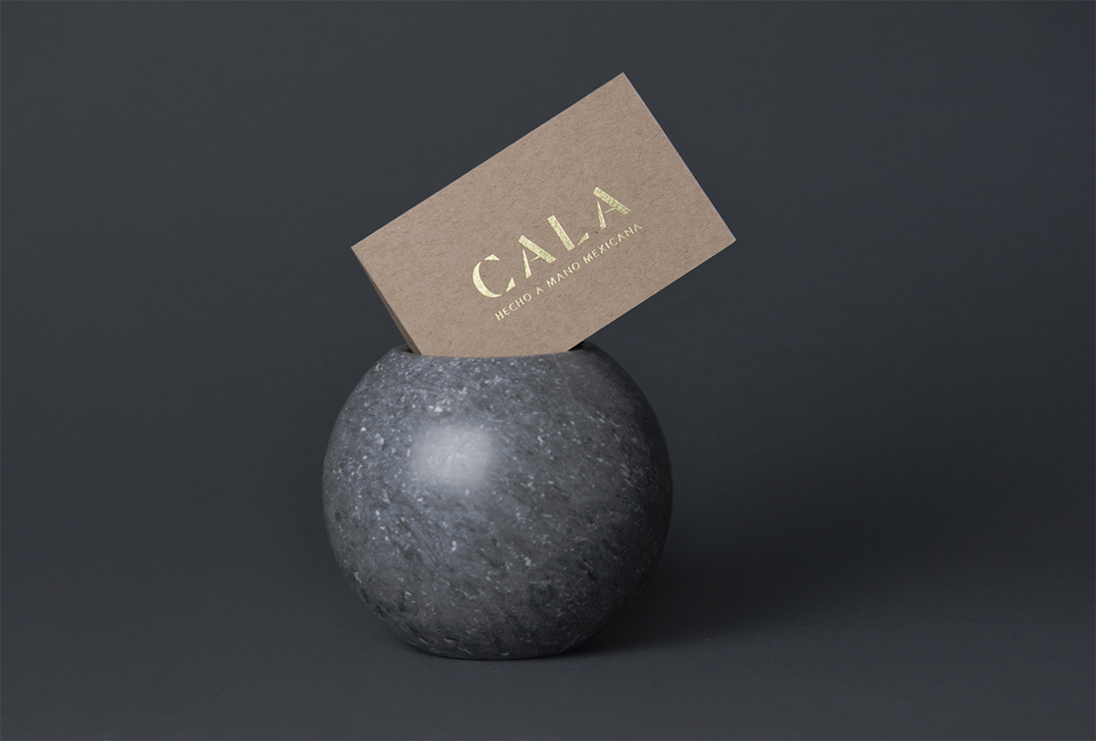
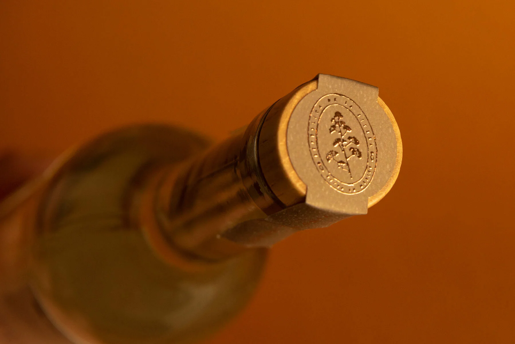
BRAND ELEMENTS
Pechotierra’s brand elements are well-chosen and done with great detail.
The wordmark is hand-crafted, but based on newspapers and prints we found from this era. The very narrow serifs reflect the way newspapers use small space for headlines, much like the way we are using the label to define the width. This worked perfectly for a long name that has to live on quite a narrow bottle. By creating this manually, we were able to add details to give it a worn-out feel.


The maguey (the plant) is used as a marketing tool, to make sure that when customers see this product for the first time, they relate it directly to mezcal. Since Pechotierra is from Nuevo Leon, it cannot be called “mezcal” because of its designation of origin, so we cannot write this word on the label, but we can definitely put it in people’s minds.


The seal’s design references old seals used during these war times. We decided to call attention to the top part of a maguey, because these flowers are the ones that keep the species in reproduction. This is something that is very important to the team, their mission is to take care of these species and make sure they don’t become extinct from over-production.

BRAND PHRASE
“Republica de la sierra” is a direct reference to the name this possible country would’ve been called. We cut it short to emphasize the “sierra,” the mountainous region where one can find these magueyes.


CLIENT SATISFACTION
“I loved the genuine interest Caracter showed when wanting to work on this project from the first videocall we had. Since the first moment, there were ideas and suggestionas that, with the passing of time, were able to be conceptualized and ended in an incredible piece of work.”
— Enrique, Co-owner of Pechotierra, pictured above with a tattoo of his new logo.
WHAT WE DID:
— Naming
— Branding
— Label Design
Design: Caracter
Design Direction: Adriana Longoria
Design Support: Regina Kaún
Photography: Adriana Longoria
VIEW MORE PROJECTS: