
THE BRIEF
Suculenta Repostería is a holistic dessert shop that creates healthy versions of delicious treats. Their philosophy is that we all have the ability to heal through the food we eat. If we eat ingredients that benefit us, we will have healthy bodies, strong minds and free souls. Suculenta was looking to refine their brand identity so it could express this concept more clearly.
CONFLICT
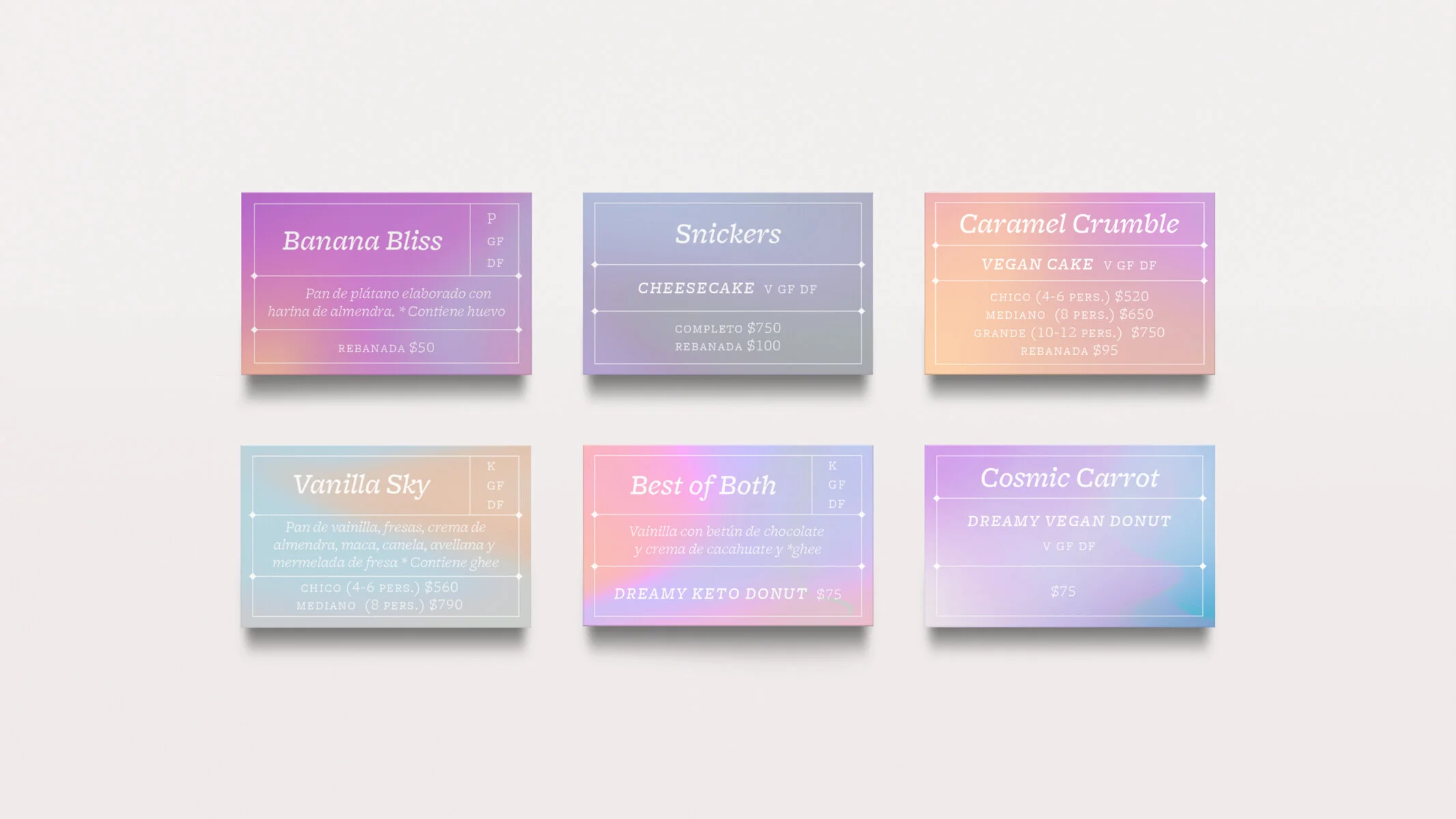
The communication lacked clarity on why these pastries cost more than regular ones, since not all customers realized that these products are vegan or gluten-free, and therefore use premium ingredients. The letters of the wordmark were also somewhat similar to other local bakeries, not standing out as the unique dessert boutique that Suculenta is.
SOLUTION
The result is a dreamy branding system that involved reworking the identity and designing packaging, menus, illustrations, copy and social media, as well as other material. The idea is for all touchpoints of the corporate branding to communicate the holistic concept behind their ingredients, their philosophy and their individuality as pioneers in the vegan/gluten-free dessert industry in Monterrey.

THE WORDMARK
Part of this redesign involved tweaking the logotype. We designed custom typography so the letters would create a unique mark and allow the brand identity to express its mystic, dreamy, elegant personality. This was also useful so the brand could stand out from its local competitors who had similar logotypes.


ART DIRECTION
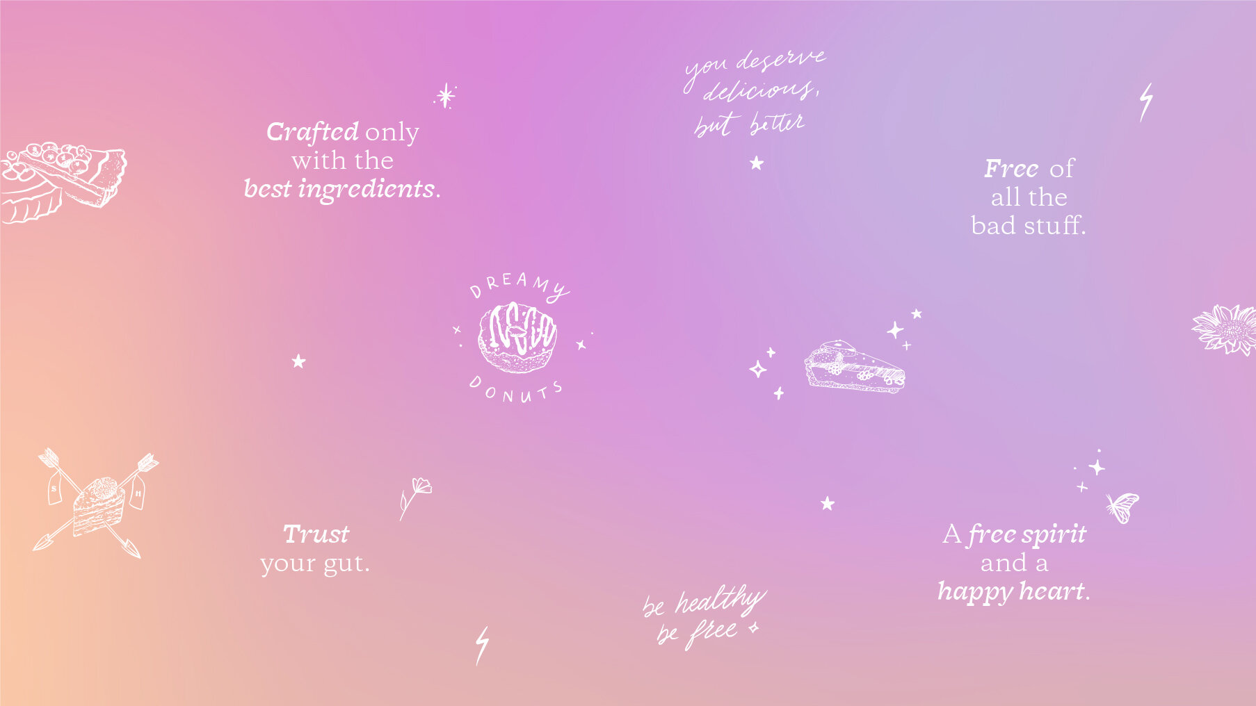
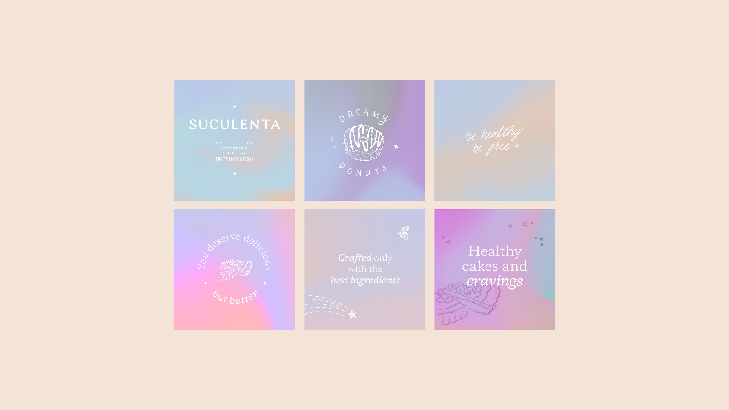
The characteristics of this brand were defined as mystic, bohemian and dreamy, with a touch of retro elegance, bright pastels and holistic well-being.
Suculenta’s brand consists greatly of the use of color. The gradients used throughout the system are swirled in a way that represents the process behind combining magical ingredients and crafting the baked creations. The main phrase spoken by the brand is “You deserve delicious, but better,” to remind us that using healthy ingredients doesn’t need to make desserts less yummy. Vegan or not, you deserve something delicious! Other phrases emphasizing this idea and the freedom we get from these healthy habits were implemented as well.
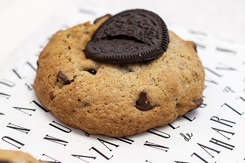
The business previously used some illustrations and enjoyed the whimsical element they added to their material, so we developed a few more that were more closely related to their specific products, and complemented them with handwritten messages as well.

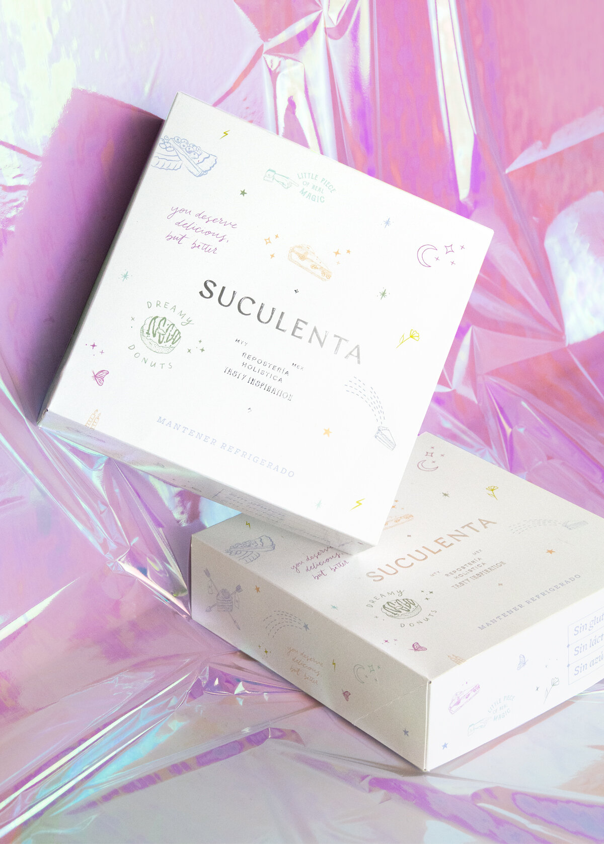
PACKAGING
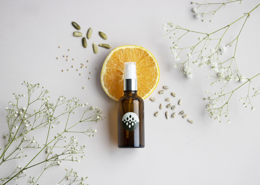
An important result of this redesign involved creating material for selling & gifting the treats. We created different boxes for donuts, cakes, cookies and pie slices to add excitement to the experience of receiving these products. The boxes were designed for Christmas gifts and use silver foil, colorful illustrations or gradients for a fun, yet elegant approach, but the idea was to keep it versatile enough to use for any season. Stickers were also made to identify the treats as vegan, keto, paleo or gluten-free.
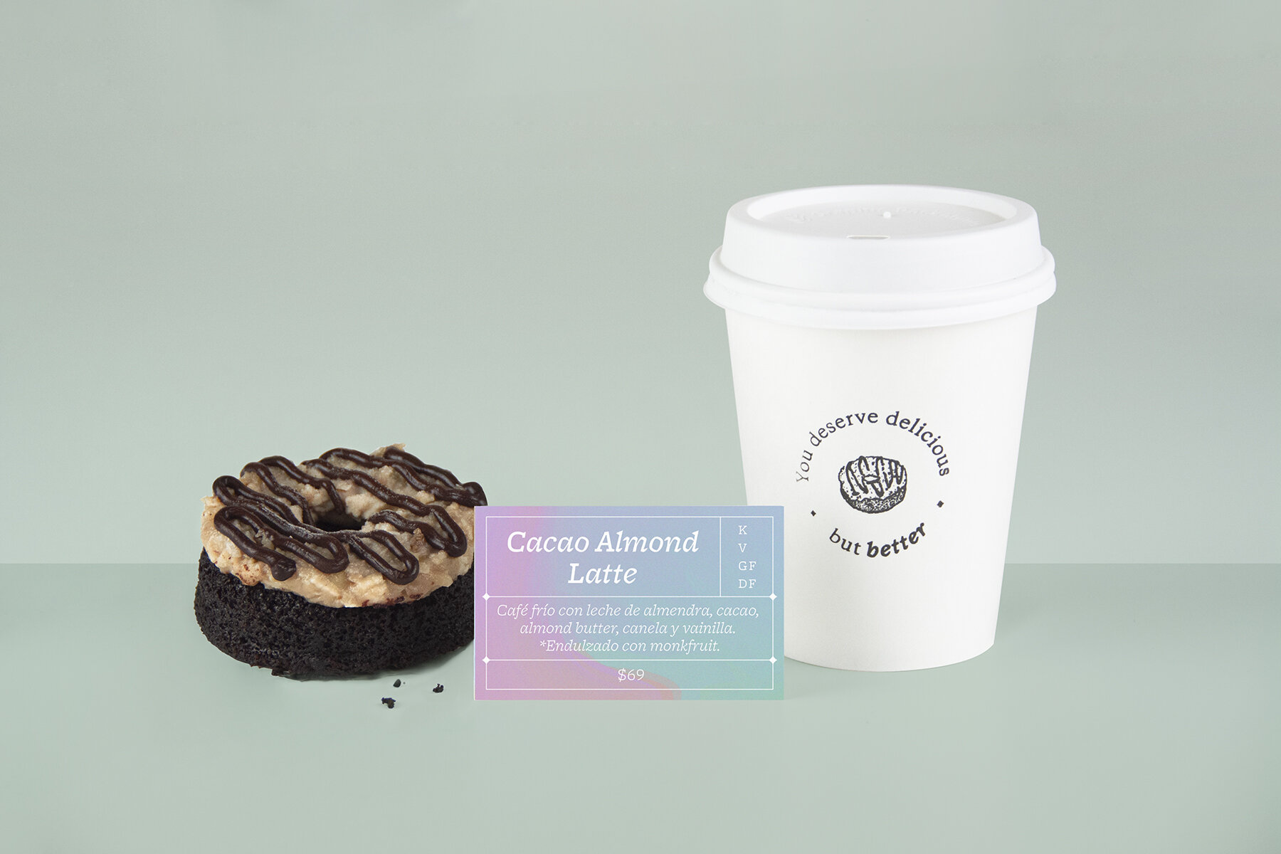


The colors and illustrations give life, not only to the packaging material, but also to the social media content.

WHAT WE DID:
— Rebranding / Corporate Branding
— Packaging Design
Design: Caracter
Design Direction: Adriana Longoria
Design Support: María Paula Valdés
Photography: Adriana Longoria & Adriana Quintanilla
VIEW MORE PROJECTS: