THE BRIEF
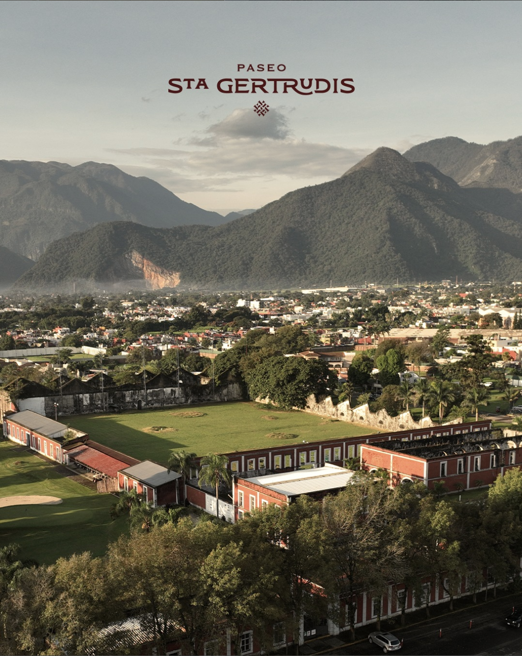
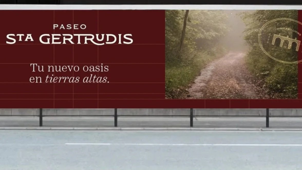
Paseo Santa Gertrudis is a mixed-use development located in the Orizaba, Veracruz, designed to integrate residential spaces, retail, medical offices, a hotel, and communal areas within a walkable environment.
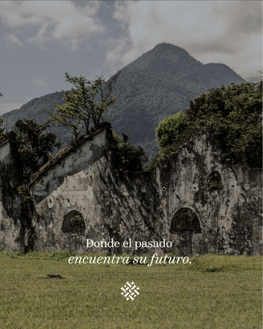
The project is built in the area where the historic jute factory, La Fábrica de Fibras Duras Santa Gertrudis, was located and where some structures from 1892 still remain. It sits within an area rich in history and natural beauty, adjacent to Club de Golf Santa Gertrudis, recognized as the oldest golf course in Mexico.
Our challenge was to create a visual identity capable of representing more than a real estate development. The brand needed to communicate heritage, trust, and aspiration, while reflecting the functional and community-driven nature of the project.
Over 130 years ago, the factory was founded by Scottish industrialists, who also established the neighboring golf course. This industrial past became a key foundation for the identity.

THE CONCEPT
Paseo Santa Gertrudis was conceived as a contemporary town center rooted in history.
The concept emerges from the coexistence of past and present. The historic structures on the site — which are being preserved and restored — act as anchors of memory, while the new development introduces residential, commercial, and social spaces designed for modern life.
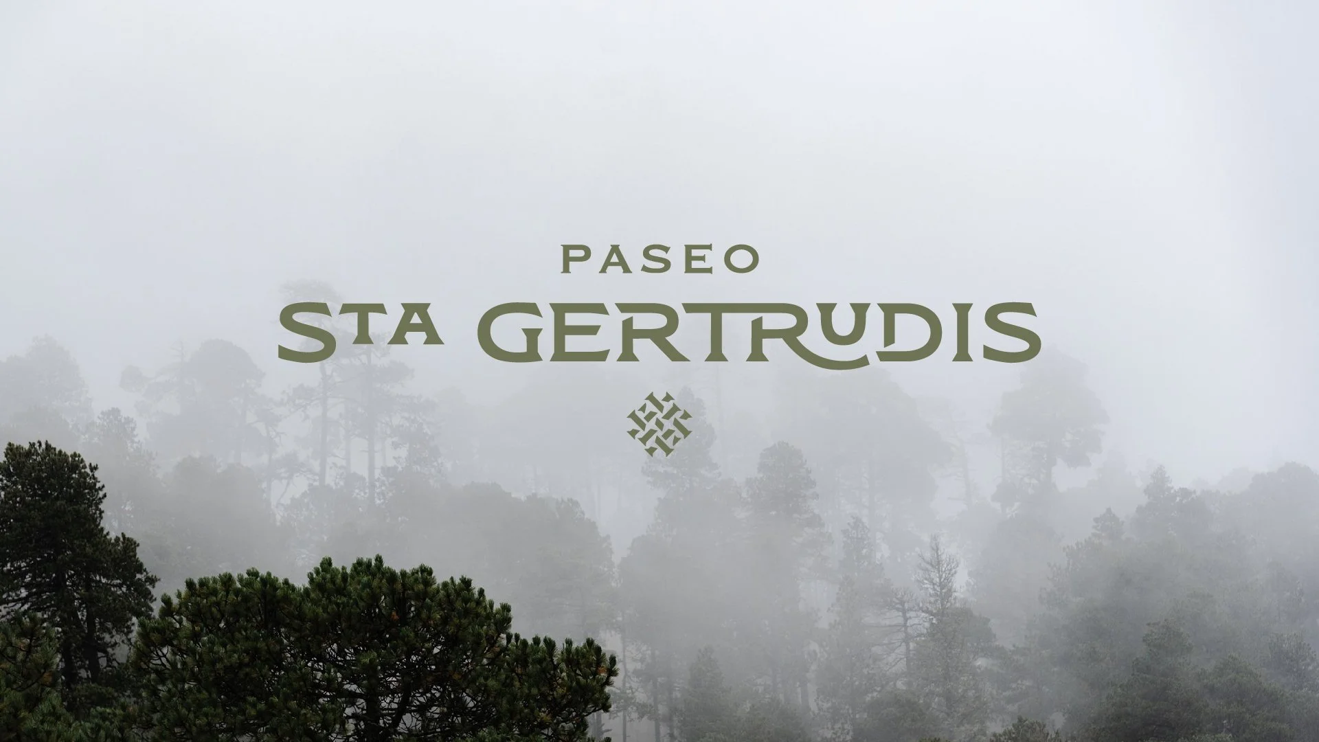
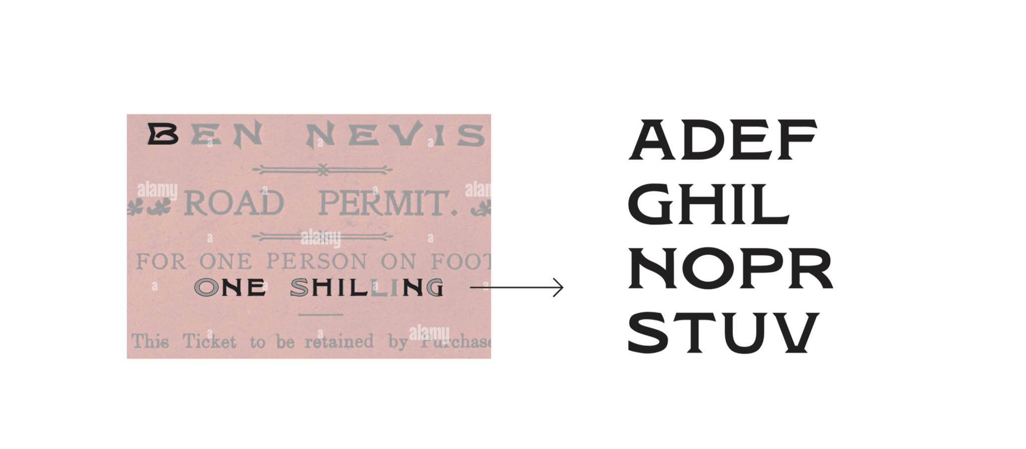
The identity draws from this history through references to the site’s Scottish origins. The typography is inspired by industrial signage found in Scottish factories of that era, evoking functionality, character, and permanence.
THE SOLUTION
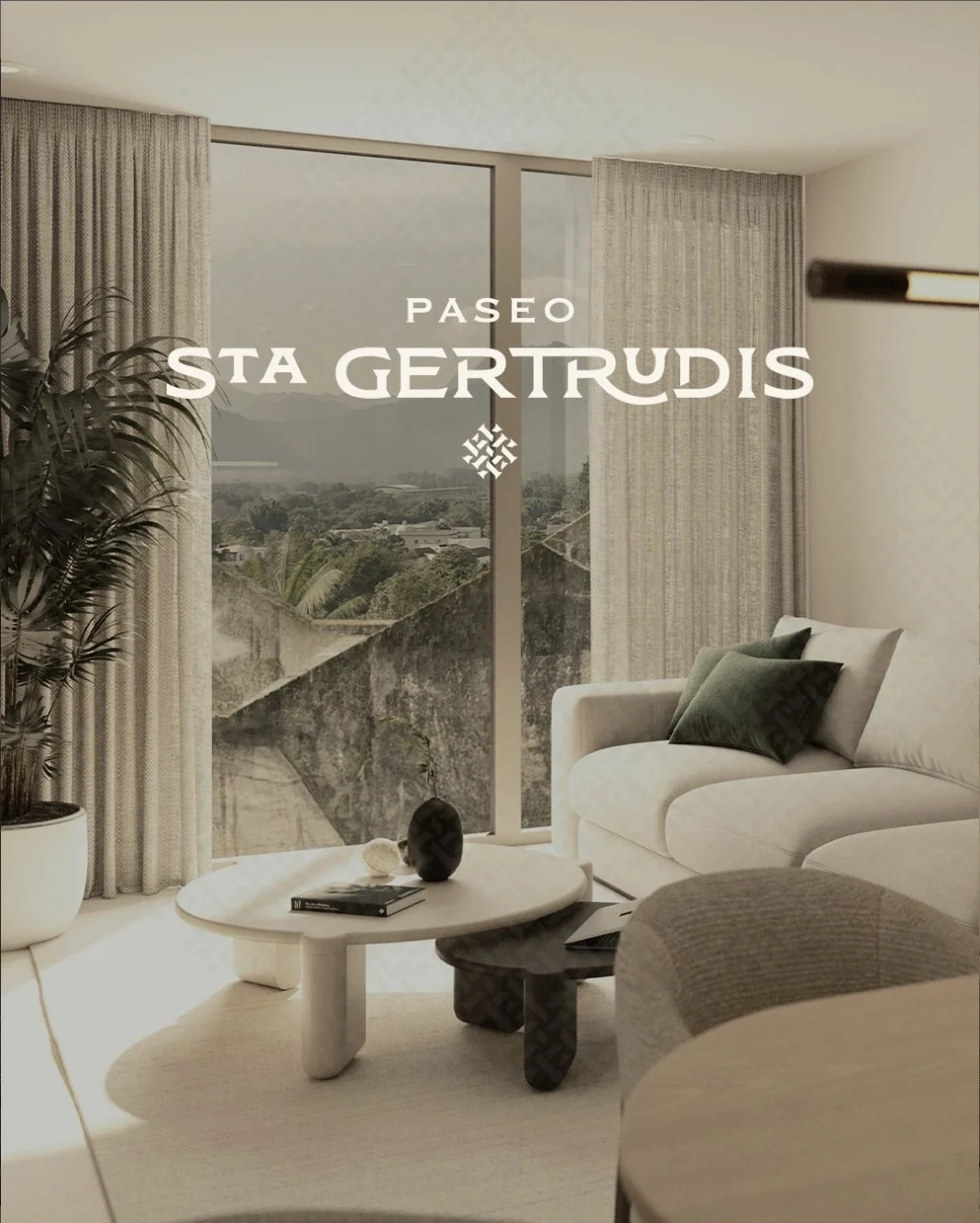
We developed a visual identity that reflects the historic character of the site and its role as a new urban hub.
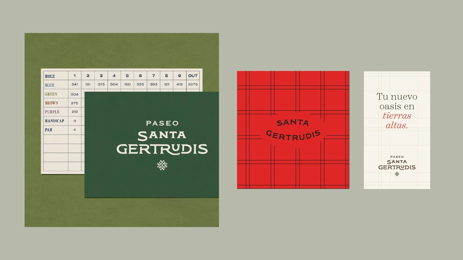
The graphic system takes inspiration from Scottish tartan textile patterns, reinterpreted not only as a visual reference but as a structural grid used to organize images, layouts, and communication across the brand.
In this way, the visual language connects directly to the site’s textile heritage while creating a contemporary and flexible design system.
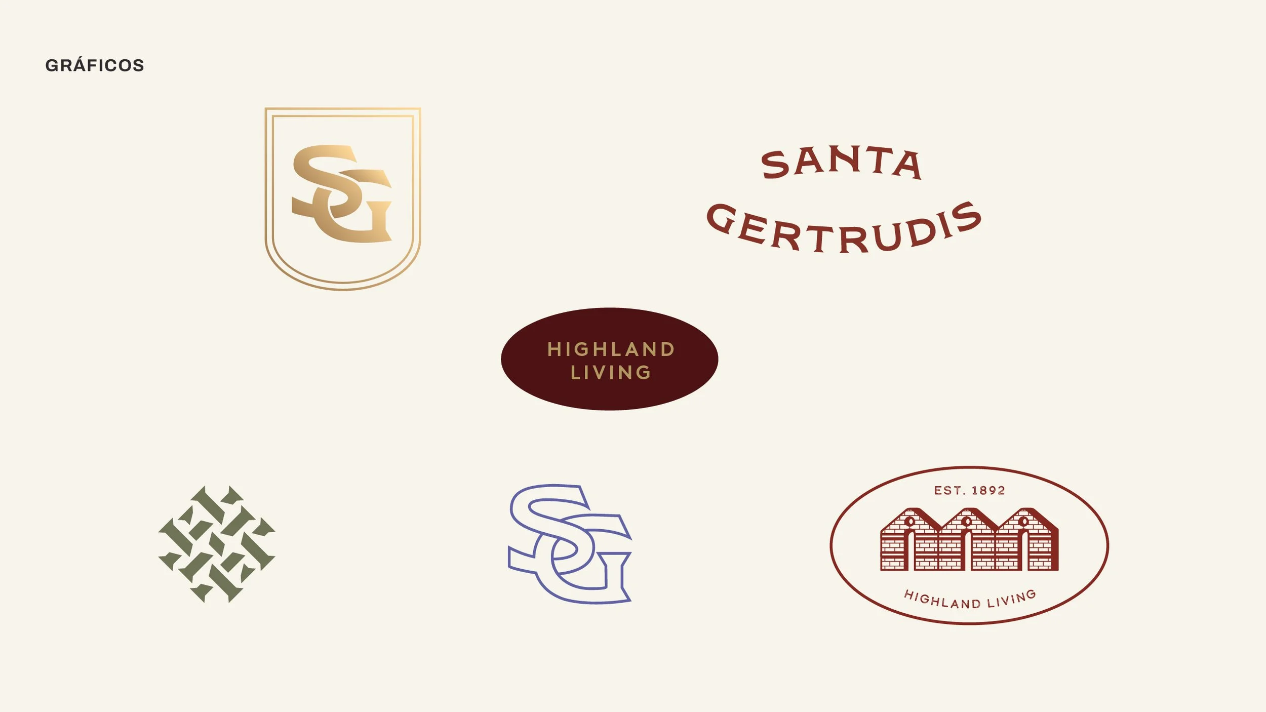
The brand’s symbol represents the jute history in the area. It is formed with the wordmark’s graphic language to maintain congruency between both logos.
The result is a brand that balances historical legacy with modern living, positioning Paseo Santa Gertrudis as a place where people can live, work, and gather in an aspirational and well-connected environment.
THE ESSENCE
Paseo Santa Gertrudis is more than a development — it is a place built on history.
Drawing from the site’s industrial past and its Scottish textile heritage, the brand reinterprets the past to create a new space for community and connection.


WHAT WE DID:
— Branding
Project by Orange Investments
Architecture by KMD Architects
Design: Caracter
Design Direction: Adriana Longoria
VIEW MORE PROJECTS: