THE BRIEF
Patricia Cires is a fine jewelry brand built on generations of craftsmanship, offering timeless pieces in gold, silver, and natural stones through a shopping experience rooted in trust, warmth, and personal connection. Over the years, the business had naturally evolved. Clients weren't just returning for the jewelry—they were returning for the confidence they felt during the experience. The personalized guidance, honest recommendations, and genuine care had become just as valuable as the pieces themselves.
The challenge wasn't the product, the quality, or the service. It was perception. While the business had become modern, approachable, and deeply human, its identity still reflected a more traditional expression of luxury. There was a growing disconnect between what people expected before walking into the store and what they actually experienced once they did. Our role wasn't to reinvent Patricia Cires. It was to reveal what the brand had already become.
THE SOLUTION
One of the biggest misconceptions about branding is that it begins with aesthetics. It doesn't. It begins with understanding what people are actually buying. During our Brand Discovery process, we uncovered that Patricia Cires wasn't simply selling fine jewelry. The jewelry was the product, but the real value lived somewhere else. People came because they felt guided instead of pressured.They felt confident instead of intimidated. They felt understood.That insight completely shifted the direction of the project. Rather than building an identity around traditional luxury, we built it around human luxury—a more intimate, honest, and approachable interpretation of what fine jewelry can represent. Luxury not as exclusivity, but as trust. Not as status, but as meaning. Not reserved for life's biggest occasions, but woven into everyday moments worth celebrating. Once that became our strategic foundation, every creative decision had a clear purpose.
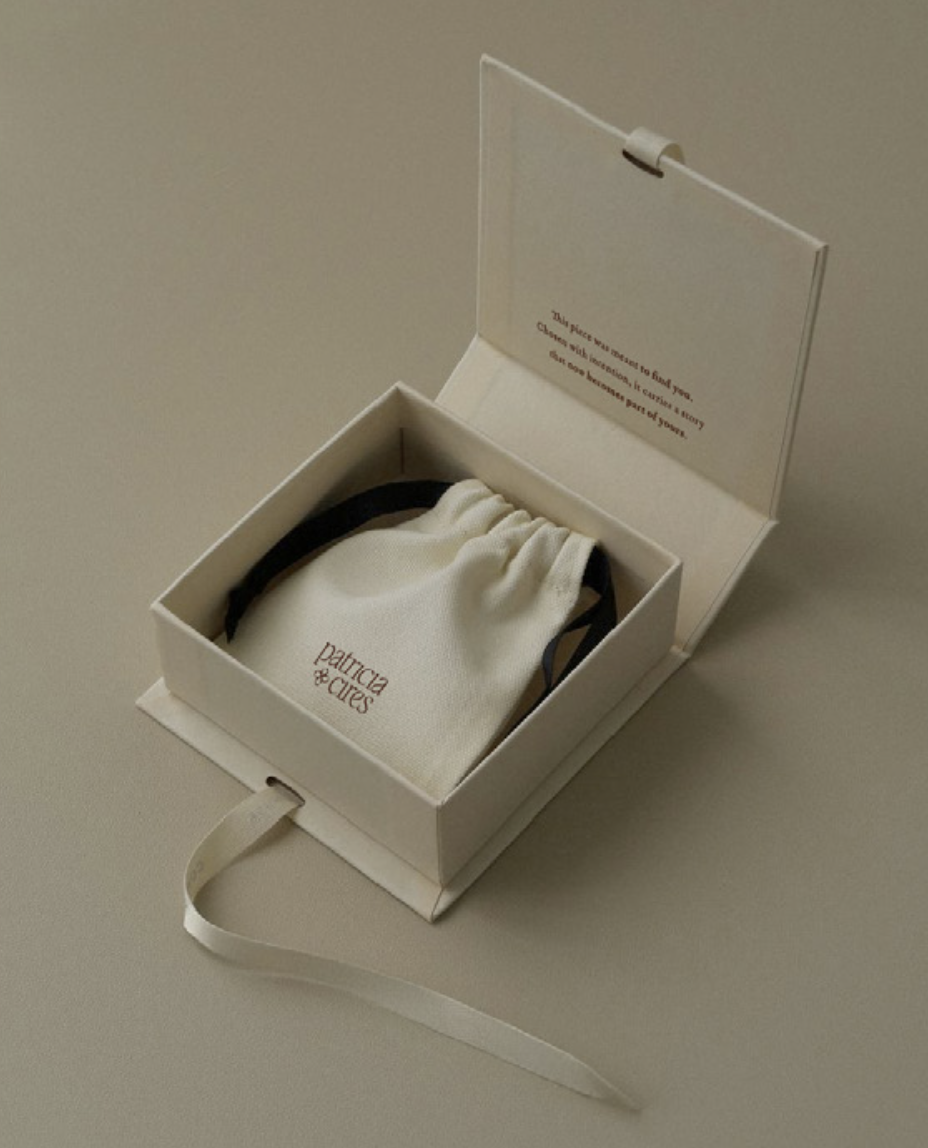


DESIGNING THE EXPERIENCE
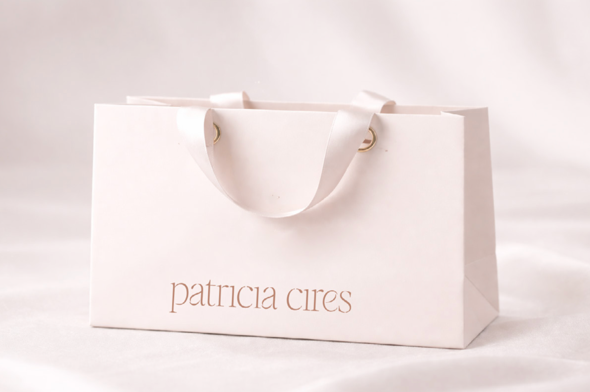
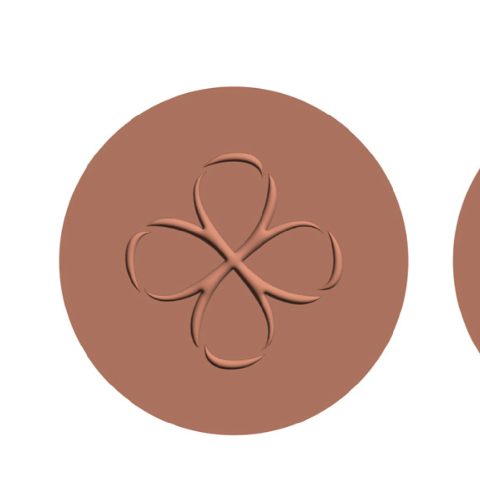
The identity was designed to communicate a feeling before communicating a product. Every visual decision was made to express the same warmth, confidence, and sophistication clients already experienced in person. Instead of relying on conventional luxury codes that often create distance, the system embraces a quieter elegance—one that feels timeless, effortless, and genuinely welcoming. More importantly, the experience extends far beyond the visual identity. From personalized consultations to curated collections and in-store experiences, every touchpoint reinforces the same promise: thoughtful guidance, meaningful connection, and jewelry that becomes part of everyday life rather than something reserved for special occasions. Because branding isn't about making a business look different. It's about making its true character impossible to miss.
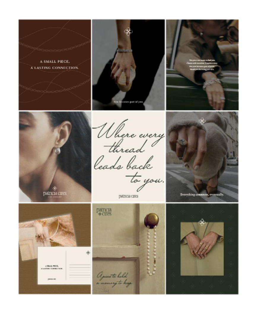

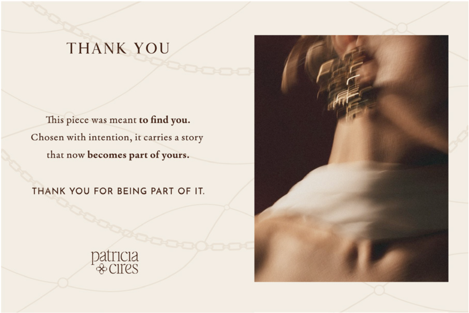
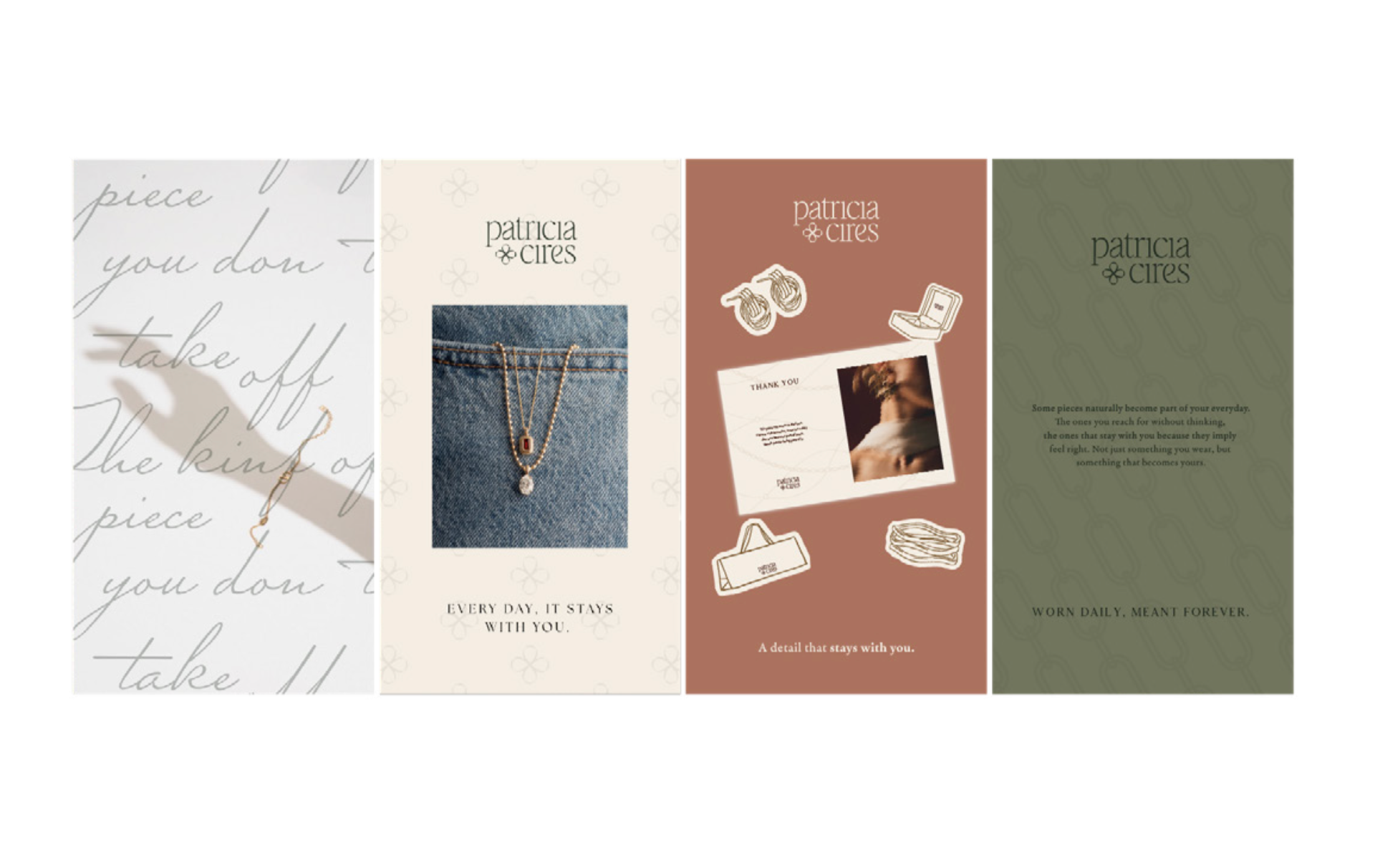
WHAT WE DID:
— Rebranding
— Brand Guidelines
— Artwork
Design: Caracter
Design Direction: Adriana Longoria
Designer: Adriana Longoria
Photography: Diego de la Rosa
VIEW MORE PROJECTS: