

Akaya is a brand dedicated to the physical and digital distribution of comic books and mangas. The identity consists of few elements: the wordmark, the colors and the graphic pattern, all inspired by comic book-related visuals.

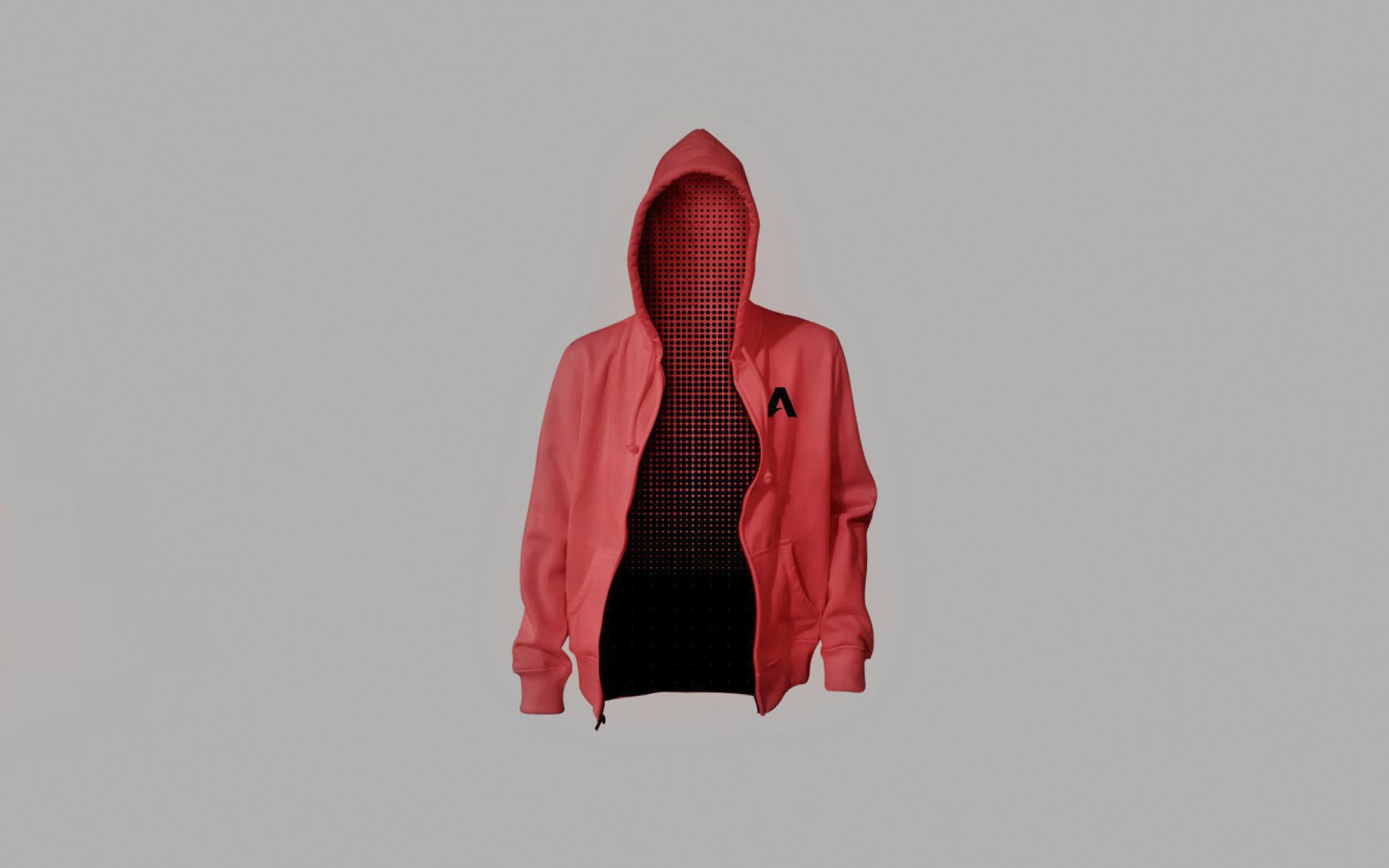
The custom type is born from the diagonal, a symbol of progress and action, combined with a passionate red inspired by our favorite superheroes


The store referenced retro record stores combined with industrial materials. Custom furniture was also developed by the interior designer.


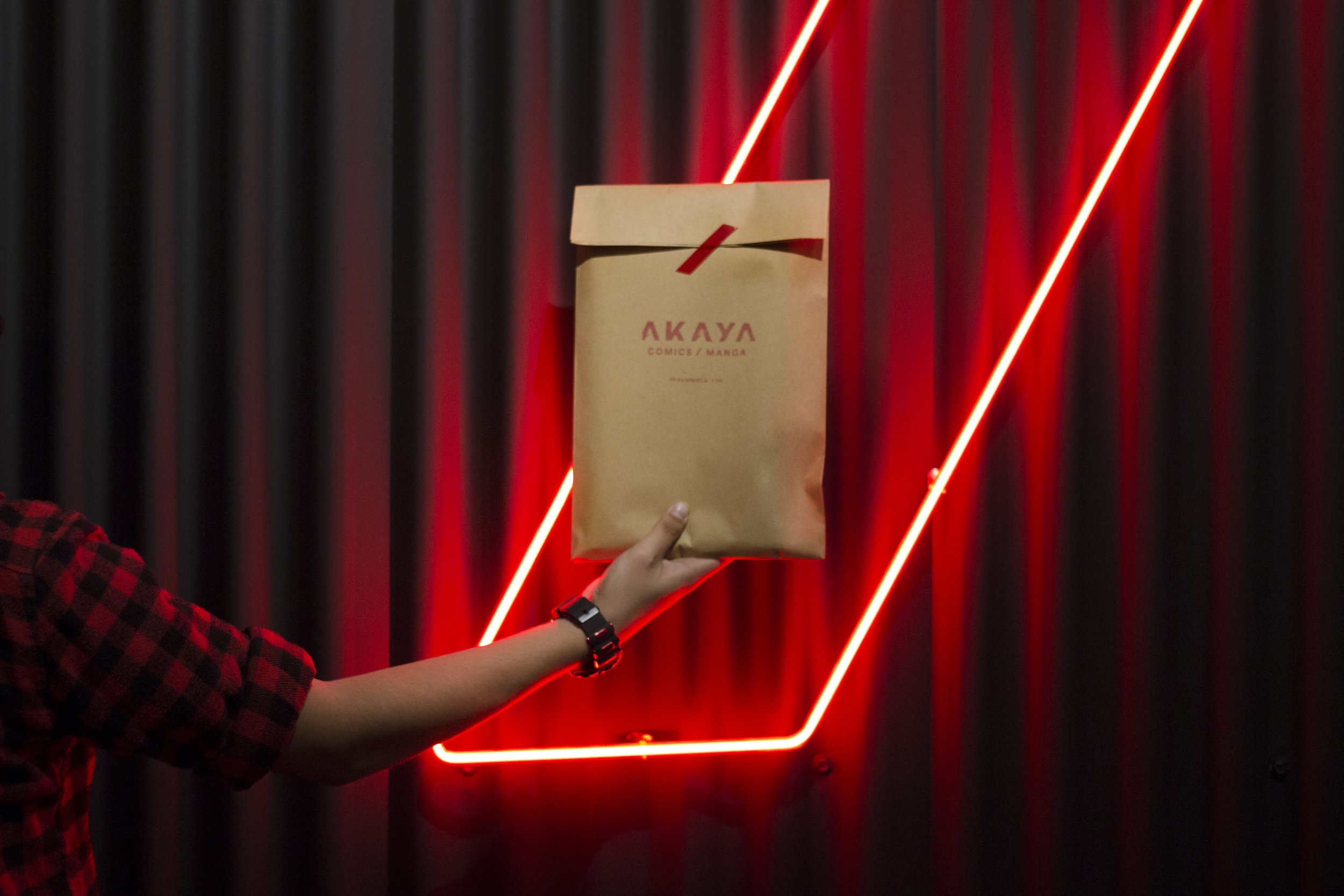
Packaging was kept simple, referencing the "brown bag" regularly used in these kinds of shops with a stamped logo.


WHAT WE DID:
— Naming
— Branding
— Interactive Design (App Interface)
Design: Caracter
Design Direction: Adriana Longoria
Design Support: Nicole Diamant
Interior design: Daniela Longoria
VIEW MORE PROJECTS: